Siren
A new take on the dating app
Intro
Week 1-2: Defining problem statement
Week 3-4: Creating a persona and defining behaviors
Week 5-8: developing solutions and prioritizing hypotheses
Week 9-11: Sprint 1 testing red flags feature
Week 12-14: Sprint 2 testing required video calls
Week 15-16: Final Prototype
Solution
Role
I provided creative input and facilitated user tests, bringing fresh ideas and ensuring effective communication. My role helped bridge our creative vision with user needs, turning feedback into actionable insights that kept the project user-centered and collaborative.
Project Summary
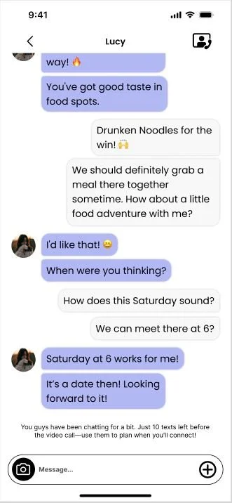
In our second round of testing, we examined the mandatory video call feature to assess user acceptance and catfish detection. We set up a control date with mismatched images to test users’ responses, initially interacting over Discord chat before transitioning to video. All users, except one with anxiety, identified the catfish—either confronting it, blocking it, or addressing it later. This feature received unanimous support for boosting user confidence and safety.
Further testing addressed a challenge when users ran out of texts, leaving one unavailable to answer the call. We tested preferences for scheduling, offering options like extra texts, a slider for free hours, and a calendar. Users favored simplicity, leading us to implement an automated message that prompts for scheduling once text limits are reached.
Reflection
At Kennesaw State, I collaborated with a team to conceptualize a dating app designed to prioritize user safety. Throughout 16 weeks, our group engaged in the development of this project, aiming to foster a secure and comfortable environment for users navigating the realm of online connections.
Timeline
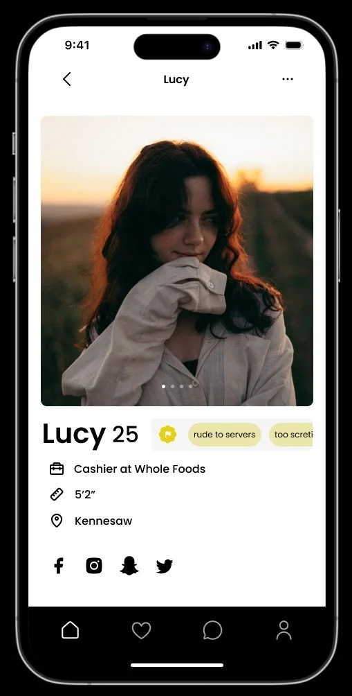
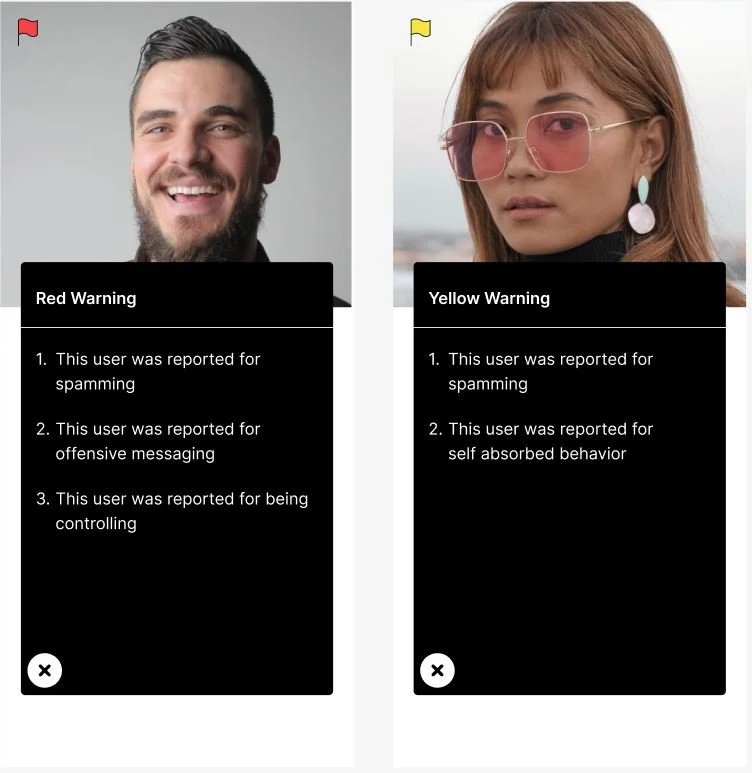
Siren introduces a groundbreaking approach to online dating, dismantling the digital barriers between individuals by unveiling the authentic aspects of each date. User profiles feature "Red Flags" reported by other accounts, categorized as green, yellow, and red – with red flags indicating more serious concerns. In a virtual realm where people often present a curated version of themselves, these flags serve as a powerful tool, offering glimpses into the genuine nature of individuals.
Product Problem Space
The present state of safety in online dating has predominantly emphasized swift matches, lacking a thorough examination of potentially risky users. The dating app scene is riddled with risks, from potential aggressive dates to the widespread problem of catfishing, causing emotional distress and uncertainty. Navigating the shift from online connections to real-life encounters heightens concerns about personal safety. To counter these challenges, implementing strong security measures, educating users on safety practices, and adopting proactive strategies against catfishing is essential for cultivating a secure and trustworthy environment for those seeking companionship online.
Our target audience comprises primarily young daters aged 18-25. Our proto persona, Aubrey, embodies an introverted individual with limited dating experience, seeking a genuine connection online while avoiding the pitfalls of catfishing. In our initial hypothesis, we envisioned empowering users with the tools to identify potential red flags and steer clear of harmful dates. To implement this, we proposed a "Reports Callout" section on each user's profile, openly listing their red flags for others to see. In our second hypothesis, we posited that incorporating mandatory video calls could effectively diminish the presence of catfishes. Users would be allotted a limited number of text interactions before engaging in a video call, facilitating an initial connection. We prioritized these two hypotheses due to their promising potential, deeming them worthy of rigorous testing. While brainstorming additional features, we identified some as foolproof and excluded them from testing, while others appeared high-risk with low reward, prompting us to abandon those ideas.
Choosing the reports callout feature as our initial testing focus was driven by the foundational importance of red flags in our app concept, coupled with uncertainties about user preferences for such visibility. Creating two test accounts—one with minor warnings or yellow flags and the other with major warnings or red flags—enabled us to gather user feedback. Valuable insights emerged, revealing users' positive response to the transparency of showcasing flaws and refining our understanding of categorizing warnings as yellow flags, red flags, or bannable offenses.
Automated message appears at bottom of chat
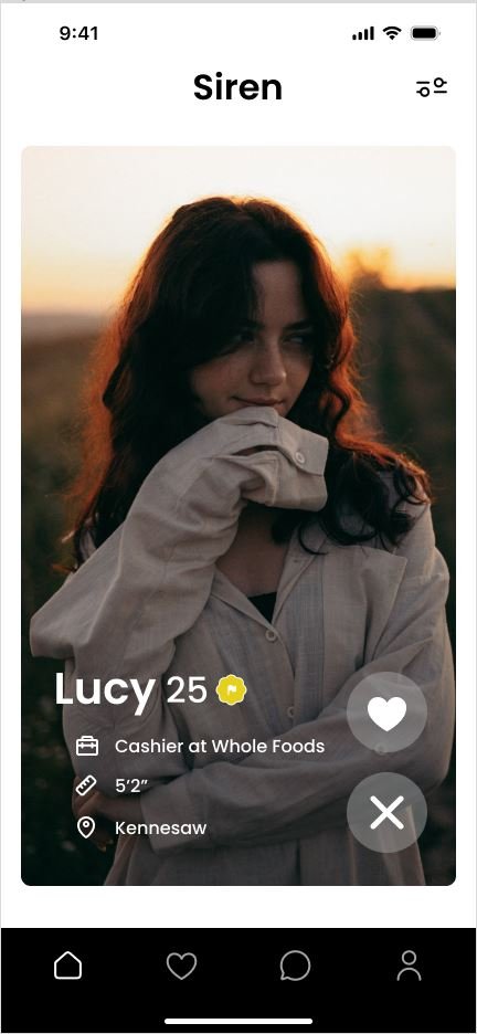
After learning the importance of different flags to users, we faced the challenge of displaying them on profiles without overwhelming the user. We gathered feedback on whether users preferred flags prominently displayed or hidden. Opinions were split, with some preferring a more discreet option. Based on this, we designed a pullout menu at the top, allowing easy access to the flags while keeping them unobtrusive and viewable only when users choose to open it.
Menu opens on tap with scrollable info
Embarking on this project, I delved into Lean UX Design for the first time, and the experience proved enlightening. The immediate feedback loop with low-fidelity prototypes prevented time wastage, allowing our team to swiftly validate numerous assumptions about our users. While our group adeptly collected opinions through initial prototypes, we encountered a challenge in testing for behaviors. Recognizing this, we pivoted by going back to create experiments that provided valuable insights into user behaviors. This iterative approach significantly enhanced our understanding and guided us towards more effective design decisions.